Build your Custom Meal to Go: Case Study for EPAM
The Beginning
In summer 2019 I took part in a 3-month Design Boost Marathon at an American product development company EPAM Systems (Kyiv branch, Ukraine). In the end, I got hired being among the 5 best students in the program.
It was a great challenge for me to work along with 25 talented designers, get mentorship from EPAM’s Design team, and work on a simulation of real-world product development processes from research and ideation up to prototyping, testing, and iterating. Among the deliverables was a mobile version of the product.
We did not have real clients and the task was to work on our own ideas. To make this process easier, my project was inspired by a chain of restaurants in Kyiv — Salateira — with healthy food and the ability to customize meals.
Discovery. Observation
I was curious how the ordering process looks like when a person wants to customize the dish and there is no possibility to do this online. For Salateira, you can order a customized dish only in the restaurant.
I decided to do the fieldwork and spent several days in 4 different restaurants, observing users during rush hours.
I observed and noted everything that stood out to formulate key findings:
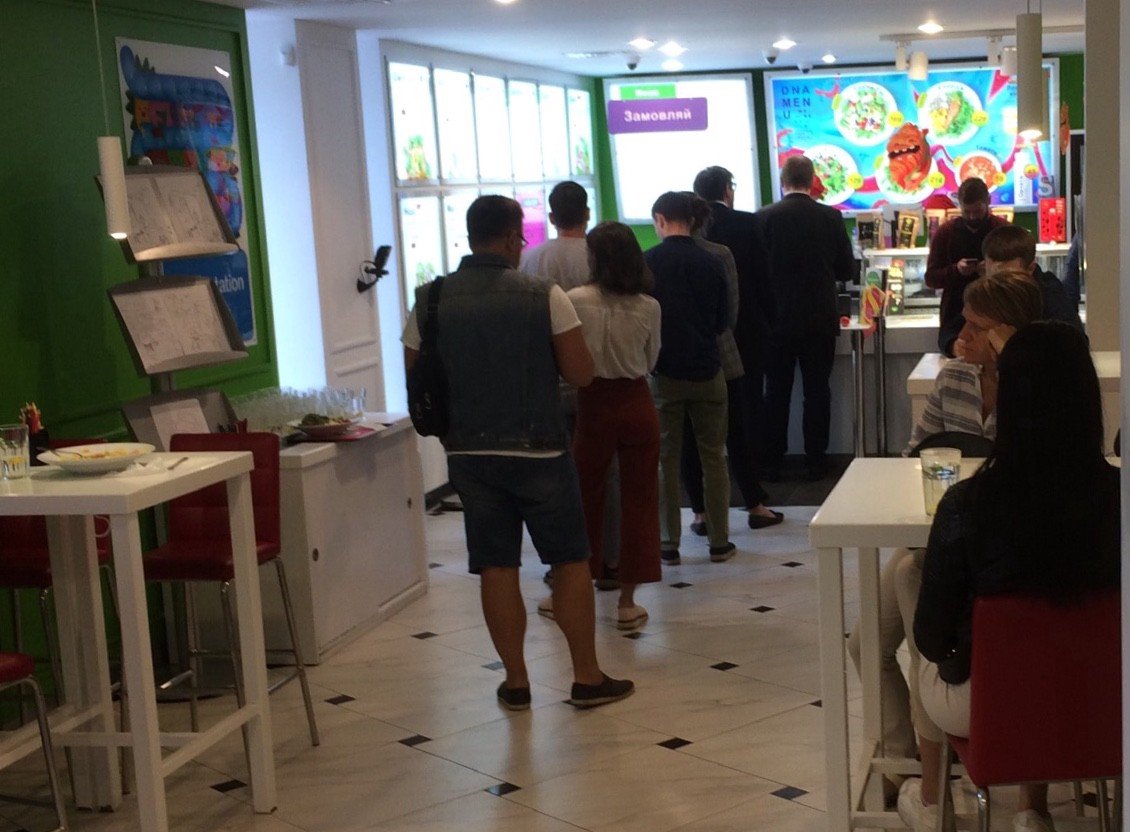
— Long queues during rush hours (up to 20 people); People might decide to leave the restaurant seeing a long queue
— Problems with notifications when your order is ready (people need to listen when their names are called; there were several situations when people with the same name came up to take the order)
— It is hard to see the final price when you change/add several ingredients, you need to calculate it for yourself if you are limited with the budget (people asked cashiers to change the ingredient to less expensive alternative)
Discovery. Interviews
After I got some understanding of the problem, it was important to find out about business and user needs.
Understanding Business Needs
It was important for me to know how the restaurant works, so I found and conducted an interview with the former marketing director of Salateira, as I consider this restaurant as a business model for my project. I got more information about business specifics, which help me to clarify the limitation the project will have:
Delivery specifics — user can’t order a delivery of a customized product, since the company does not have their delivery service; Uber Eats and Glovo do not work with customized products;
Order specifics — to make sure the user will get a freshly made product, the order should be placed in a restaurant;
Understanding Users Needs
Talking to business also provided me with the information who their target audience is: people age 20–38, who want to customize their meal in order not to get the same one every day, they often eat in the restaurant and rarely order delivery services.
I prepared a questionnaire to find the representatives of my target group. To find the customers, I perused over restaurant’s Facebook pages and wrote to those who were commenting there.
Survey’s responses
In total, I got 21 responses (17 Female, 4 Male). 11 people did not leave their contacts, since this option was not mandatory (I was looking for those who were willing to talk). 3 people met the criteria and agreed to meet in person for an interview.
Research Results
After conducting user interviews, I allocated some time to transcribe them and write all the findings on sticky notes. I used my wardrobe as a whiteboard to put all my stickers and grouped them into similar categories.
Top Findings after interviews:
Users often change ingredients they don’t like («I change 3 pairs of ingredients in my favorite salad», «I don’t like peas, change them all the time»)
Price is of the key importance since in the restaurant to build your own meal you need to calculate everything in your head; different users have different price limits («I want to eat something to think, but here I need to think a lot to eat»)
Users do not experiment a lot during rush hours because of the queue’s pressure («If I see that there is a queue, I order my usual meals, not to hold back others»)
Users prefer to pay online («I get bonuses from my bank for paying online with the card», «I don’t like to talk to people and prefer paying online, it’s much secure»)
Users usually ask not to add cutlery if they order a takeaway («I care about nature, so I write that I don’t need additional cutlery, napkins — but they usually don’t pay attention to this»)
Ideation. Storyboard
After I gathered all the information and analyzed it, the time came to brainstorm some ideas on how the project might help users in their everyday lunch experience.
I started with formulating an opportunity statement: “How might we help users order customized food by spending less time in the queue during rush hours?”
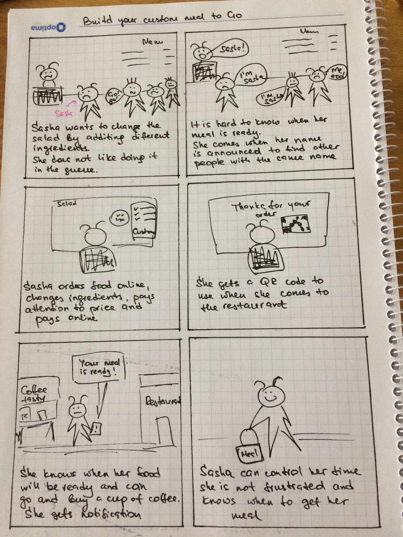
To present the solution in an easy way, I created a Storyboard to show the pains customers mentioned during interviews and pain relievers which the product would offer.
Storyboard
Alex wants to have lunch, but she doesn’t like some of the ingredients and wants to change them. She does not like spending her lunchtime in the queue
It is hard for her to know when her order is ready. She comes when her name is announced to find other people with the same name in the queue. She is frustrated.
Alex customized her meal online when she has time for it, nobody is nagging her, so she changes the ingredients she wants and pays online.
She receives a QR code to use when she comes to the restaurant.
She can spend the time when the meal is being prepared doing what she wants since she gets the SMS when her order is ready.
Prototyping & Testing
After I understood what the user wants and how their lunchtime looked like, it was the time to determine the user’s flow.
Lo-fi prototypes
Since the customization was determined to be the most important part, I created lo-fi prototypes to quickly test my decision with the users. Previous information showed that what the user wants is to choose ingredients he likes and be able to follow the price limits. I created prototypes with the ability to set up your price limit and build your own salad.
Testing lo-fi prototypes
The results of the quick user testing help identify problems on their early stages, before going into pixel-perfect solutions. I listed all the key problems the user experienced with the prototype to think about different ways of tackling problems.
Testing help me to quickly understand what should be corrected in the next iterations.
Major Changes
Reducing the number of categories so that the user will have instantly get information on what categories he could choose from.
Testing showed that prices for ingredients and final price is enough to follow your budget limit, there was no need to set up the price limit.
Checkout Experience:
Easy checkout. Since the discovery phase showed that users are in a hurry and angry if they are hungry, I created a possibility of a Guest Checkout without registration if you are hungry like a bull.
Since the studies showed that users care about the environment, I created a possibility refuse from napkins and cutlery if you order a takeaway with receiving bonuses from the grateful Earth
Order notification. I included the possibility to get the notification if the meal is ready (! for this project we had our own limitations and were creating Desktop and Mobile versions, not applications). Users also get a QR code not to think about their meal in the queue but scan the code.


